Libre Résistance has been using the logo of FFC in its correspondence and since 2000 in its bulletins. Also from 2004 onwards the logo of the Special Forces Club in London, was added.
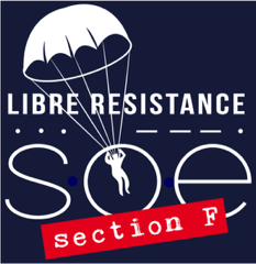
We felt that after 76 years, the time had arrived to commission a logo dedicated to Libre Resistance.
We have been fortunate to have worked with a true expert in this field, David Hawkins, who with his design company Orchestra has been responsible for the identity of numerous French organsiations such as the Banque de France and Gaz de France.
David Hawkins explained to us the important themes that he felt were important to incorporate in our new logo. Firstly it was essential to insert a parachutist as this represents the essence of SOE and is iconic. It was important to represent the full moon and this was done by adapting a font that rendered the letter “O” as a perfectly round which was then used for the word SOE. The parachutist was then overlaid over the moon. The Morse Code for SOE was added to represent the important role of radio operators.
Finally the word Section F was included to represent the notion of adventure, bravery, courage and history of the agents. To reflect the 1940’s era, the font “Typewriter” was used for Section F, overlaying a red background which reflects signage in the last war.
NEW LOGO FOR LIBRE RESISTANCE
SOE Section F